It’s not controversial to say Game of Thrones has achieved a cinematic height matched by little else on television. And that takes a lot of work! Thankfully, the conceptual basis for much of what we see on-screen is almost as impressive, and sometimes even more so. In previous years, we have shown you German studio Karakter‘s work for the show as it’s released after each season, and this time is no different!
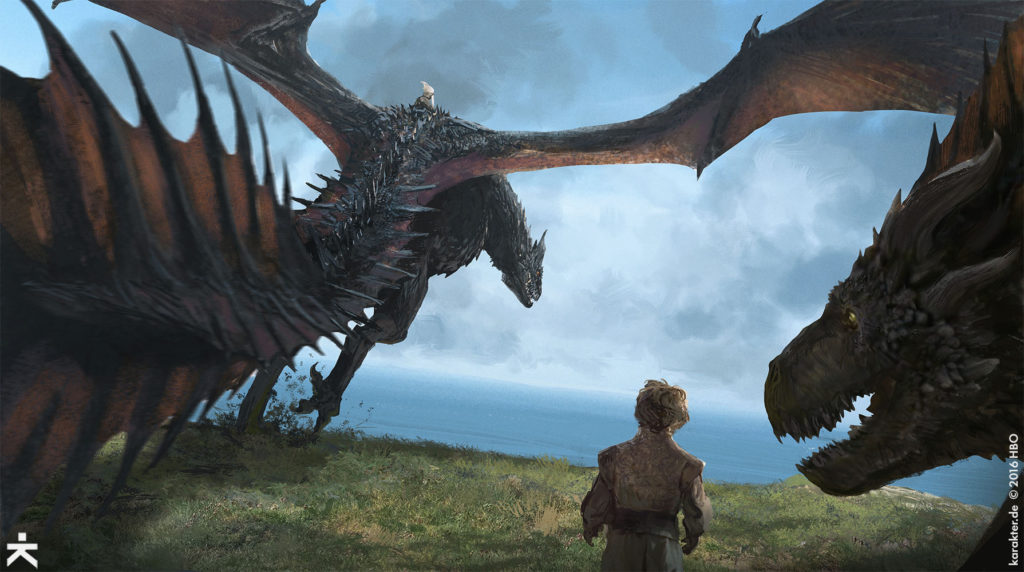
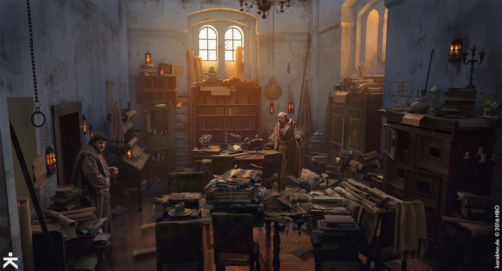
Below the cut, you’ll see jaw-dropping concept art for Dragonstone, the Citadel, the sea battle, the loot train battle ambush, the breach at Eastwatch, and more!
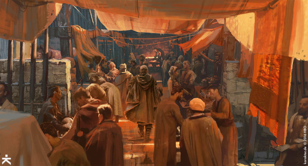
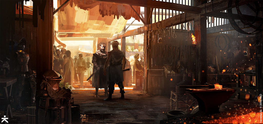
In their site, the Karakter team (art department artist Philipp Scherer, and VFX concept artists Robert Simon, Floris Didden and Tobias Mannewitz) explain that their work this time had expanded beyond what they were used to. They weren’t only working for the VFX team anymore but for the art department; their creations were being realized on set for the first time, such as the Citadel and the Street of Steel:
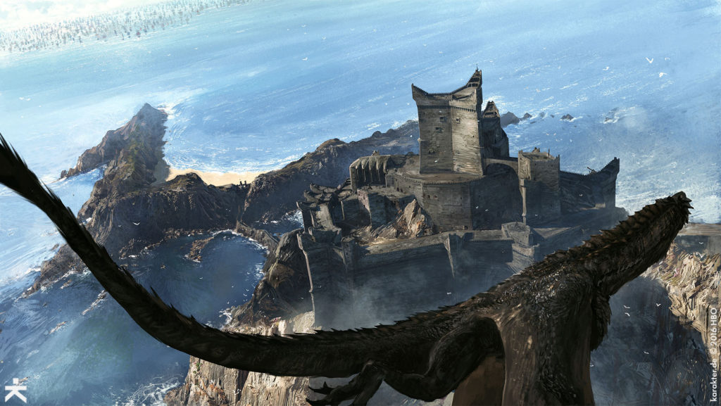
Dragonstone was rendered in a 3D model that combined the real life locations (using photogrammetry) with the purely CGI elements, so that the geography remained consistent throughout the episodes, no matter the angle of the shot:
This may seem like a little thing, but for obsessives like me, that kind of thing is appreciated; for example, King’s Landing wasn’t achieved this way early on, resulting in the geography of the city making no sense whatsoever depending on the season.
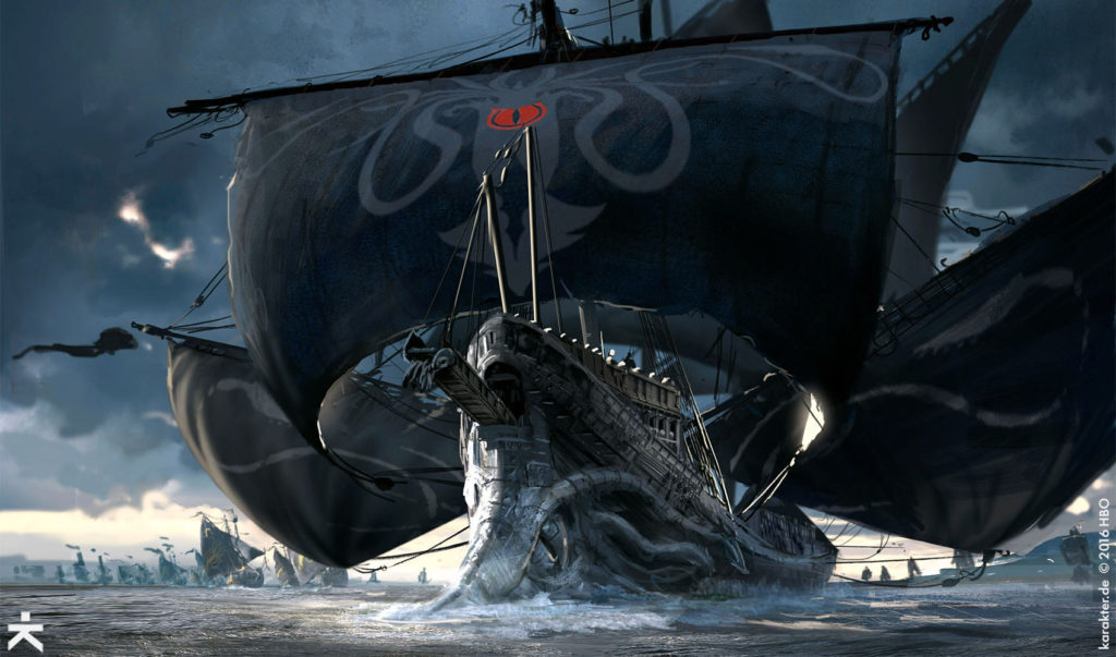
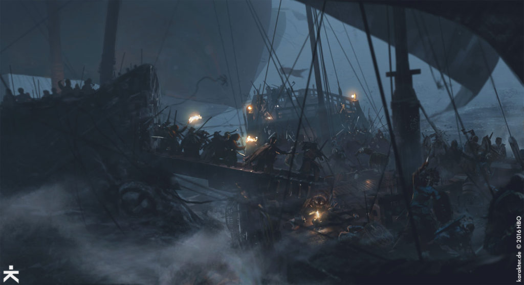
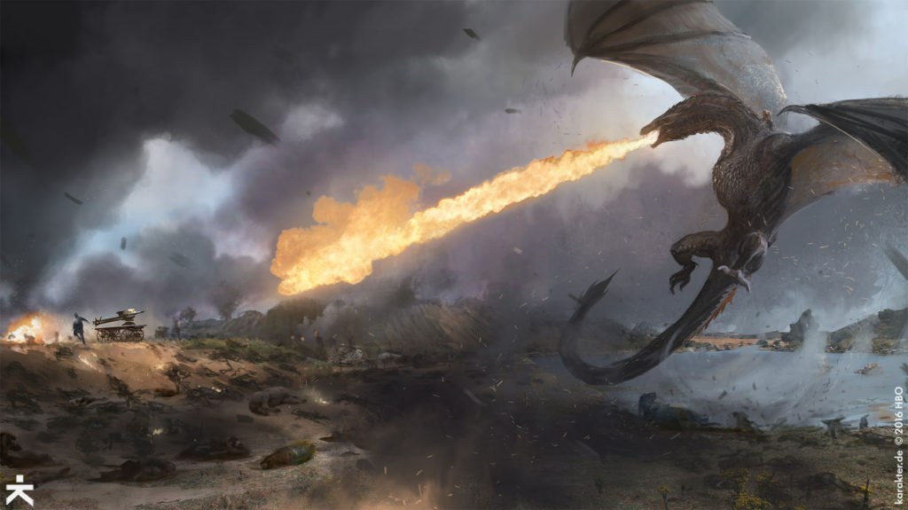
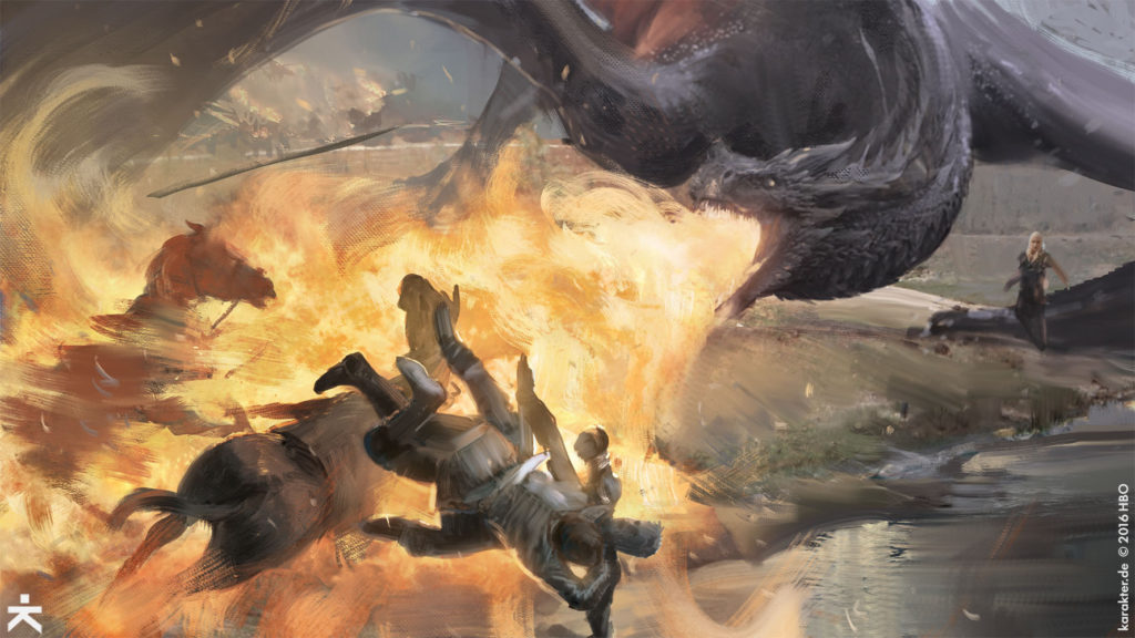
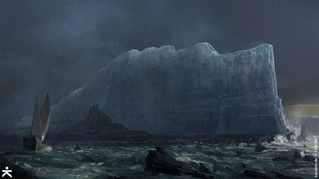
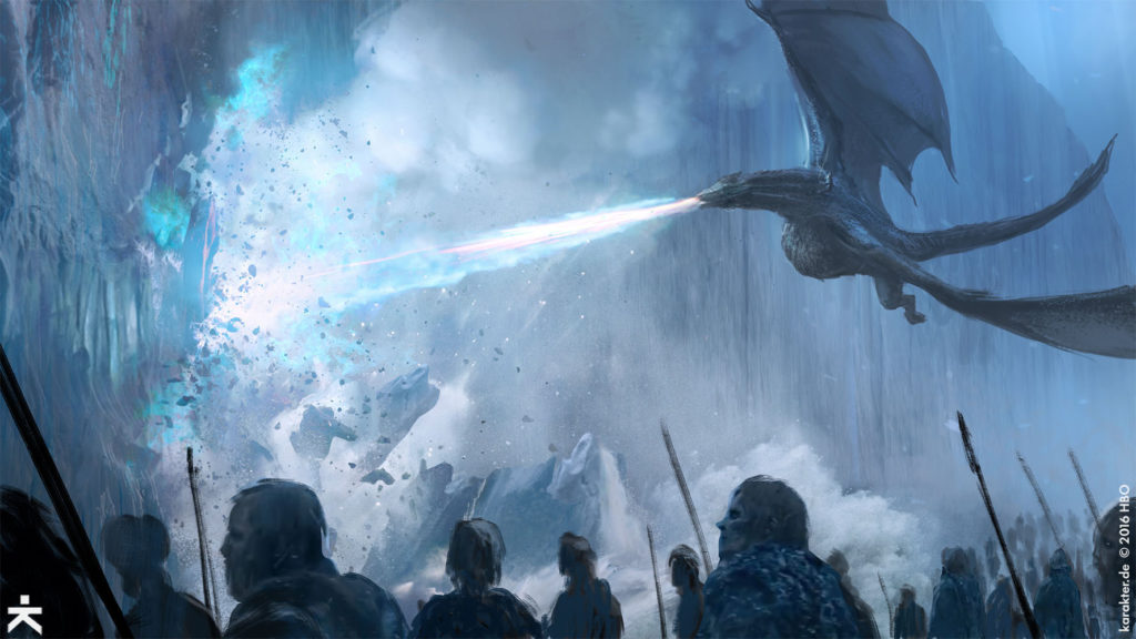
Karakter also helped create the three major setpieces of the season: the Sea Battle, the Field of Fire, and the Breach at Eastwatch. Though all of these looked astonishing on-screen, some of the concept art make them look even better, if that is even possible:
See more of Karakter‘s amazing work here! Hat tip to Kotaku!
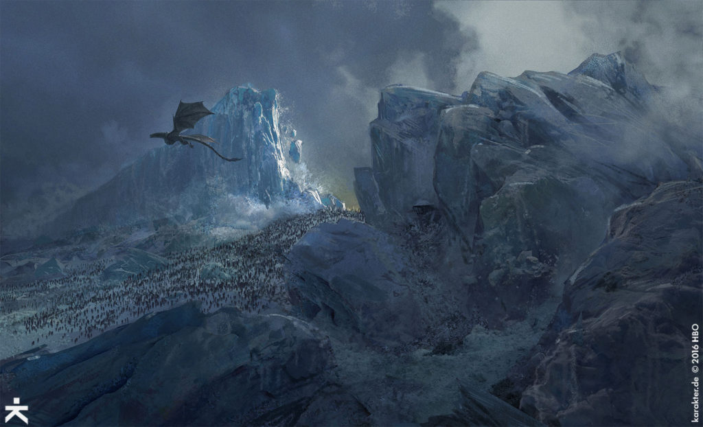
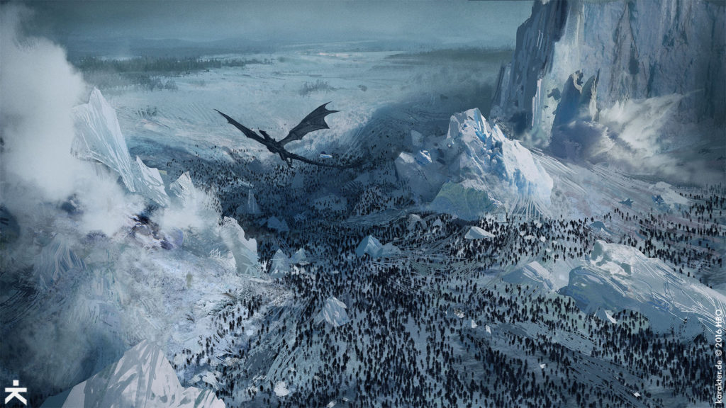
WOW…Amazing pics..congratulations to the artist..amazing work
euron’s silence looks amazing
I’d love to be able to buy prints/posters of many of these. (Hint, hint.)
That Viserion art… wow. O_O
When is the wall calendar coming out? Love, love, love.
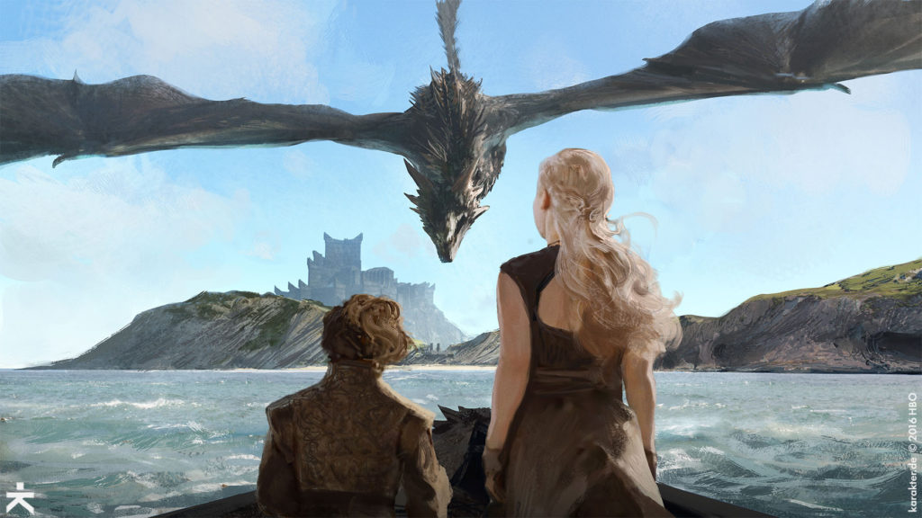
My favorites are Sam in the archmaester’s office with all of the nerd details; Davos in the armory with all of the lovely weapons details; the dragon descending on Tyrion and Dany as we stand behind them (gorgeous framing here); the sea battle showing the fight; the Wall with the ship and Eastwatch; and the dragon coming through the Wall from the perspective below the dragon.
Of the images not shown, I love the cave drawings, especially the one with Dany and Jon!!!!!! And Jaime charging Drogon. And the Winterfell courtyard. And the ones showing much more detail of the top of the Wall at Eastwatch and Eastwatch itself!!!! And the horn!
Such amazing stuff!
http://karakter.de/#/projects-post/game-of-thrones-7/
Regarding the floor map at King’s Landing, did the map have all of those lines (meridians and parallels?) in the actual show? I can’t recall them. And what does it mean that the lines aren’t perpendicularly intersecting? Is this because the poles aren’t at opposite ends of the globe? Are there three poles? And how could these things be? And is this why the seasons are so messed up?
Ginevra,
One has many questions.
😛
Clob,
No One has an answer.
Ginevra,
When in doubt, I just assume a wizard did it. That seems to be the go-to response for explaining the unexplainable in fantasy shows/movies.
Ginevra,
I wondered about that too, and interpreted it not as something geographical but rather as imagery of the sun (top right corner), the moon (left) and the Crown…
Which would make the Crown as important as the sun and the moon which is sooo Cersei 🙂
Vally,
Evenly spaced, symmetrical lines radiating out in every direction from a single point, especially on a map, typically denote a pole. You can see earth’s poles represented this way on thousands of maps:
https://37tx5035jacw32yb7m4b6qev-wpengine.netdna-ssl.com/wp-content/uploads/2014/08/longitude.png
And then here is the fantasy world Roshar with its pole:
http://www.17thshard.com/forum/uploads/monthly_2017_12/Roshar_space_v2_webres.png.ad1c19fb623986adc908546cfb804d20.png
And when you flatten a spherical map using projection, these lines go straight.
I’m sure there are many other examples. These lines going out from the poles (meridians) along with the parallels to the meridians help cartographers to tell precise locations (precise latitudes and longitudes) on a world map.
I’m asking an astronomer for help, and I’ll update if he says anything interesting.
Ginevra,
As I alluded to in my first comment, I’m sure the artists are playing here with our knowledge of imagery of cartography. They included these graphical elements in order to make the map look map-ier.
These “poles” are conveniently placed there where you would put them if you wanted to balance the composition.
I’m quite convinced that it is simply an artistic choice and I can’t really imagine that it has anything to do with the actual poles of ‘Planetos’.
“This may seem like a little thing, but for obsessives like me, that kind of thing is appreciated; for example, King’s Landing wasn’t achieved this way early on, resulting in the geography of the city making no sense whatsoever depending on the season”
THANKYOU! And NO, you’re not obsessive about the geography of KL… that damn plain where the Unsullied and Dothraki arrive outside KL in “The Dragon and the Wolf” was a huge continuity error and still pisses me off! Now I’m in a bad mood again 🙈😝
Its all fantasy – and the laws of physics don’t apply 😛
I’ve said this in the past, but for a ‘civilisation’ that’s existed for thousands of years they haven’t progressed much! Here on Earth, GoT would have loosely been our medieval era say around 500/600 years ago. Around the time of the War of the Roses.
Looks like they have never been through a ‘Renaissance’ period when scientific thinking and ideas, experimentation, etc came about in our 16th/17th centuries?
I reckon the maesters in the Citadel have a lot to blame for this? I’m not surprised why Sam left as they were set in their ways, not listening or uninterested in what he had to say regarding the White Walkers. They I presume are supposed to be the most ‘learned’ members of the Westerosi society, but were interested only in maintaining the status quo and having an easy life! Then again, there’s plenty on this world who do the same 😛
Vally,
Yes, you are correct. And this method of cartography has historical precedence. I heard back from my astronomer friend! And he gave me this article on portolan charts that were far more accurately drawn than any other charts of their time (13th century and beyond) using similar 16-point rhumb lines: “It is unknown why these particular points were chosen and why certain points are illustrated with a compass rose whereas others are not.” These rhumb lines allowed cartographers to mathematically project the three-dimensional world onto a two-dimensional surface with much greater accuracy than any techniques used before and are very similar to what we do with the poles and meridians today.
Note that the Westerosi map has 32-point rhumb lines with only one point (near Hardhome) having something similar to a compass rose.
Patrick Rothfuss, the author of the Kingkiller Chronicles, has described two types of fantasy: soft fantasy where the author ignores all logic and hard fantasy where there are certain well-defined magical elements that themselves defy logic but where everything not part of well-defined magic must follow all rules of logic and physics and natural law as we know it to be. Some prefer the first type, but I think most adult hardcore fantasy fans prefer the second. I know I do.
oh how the concept art is screaming for a remake of the whole series around 2037! you hear it scream, don’t you?
hell, that would have been some CGIs, right? it’s so sad these days it may have needed a shitcoin budget no one actually has…
i’ll be 69 in 2037. so hurry up HBO, give me these pictures!
Ginevra,
I’m glad you asked your astronomer friend 🙂
That’s a very interesting article, thanks for linking it!
Vally,
You’re welcome. I am just really glad he answered. After thinking about it, I remember mapping a triangle in surveying lab where our instructor had us add up the interior angles. We kept getting like 182 degrees or something insane because everyone knew from geometry that the sum of the interior angles of a triangle had to be exactly 180. But it turns out that is wrong! That – and all of the other rules we learn in high school geometry – only applies to planar geometry or geometry in two-dimensions. If you’re mapping a triangle on a sphere, you’re going to have very different rules and results. So I can see how mapping by these radiating lines might be the only way to accurately represent three dimensions on the page.
The surveying professor later confessed to deliberately messing with us all, saying that most would fudge the numbers to get 180. I didn’t change mine because I wasn’t sure what to change.