The contest is done and the submissions are in for the Watchers on the Wall Graphic T-Shirt design contest. Now it is your time to start picking your favorites in the first round!
Thank you to our friends over at SomethingInked and to all of the of the bottom-supporters who took the time to submit their creative designs for our first graphic tee. The shirt will be available in the WotW site store, opening in the near future.
Support your fellow reader’s time and effort by voting on your favorite!
You can vote for up to five of the designs. The top five vote-getters will be placed into a final contest vote that will decide the winner of our contest.
The contest winner will receive a copy of the shirt as well as a prize pack from Watchers on the Wall. Be sure to share this post and encourage other Game of Thrones fans to view the submissions and vote for their favorites!
Watchers on the Wall reserves the right to use any/all submissions for future promotions or merchandise at their discretion.
All submissions are subject to legal review and infringement violations and may be disqualified as a result.
Without further delay…here are your choices! After viewing the submissions, choose your five favorite designs and vote for them in the poll below the photos!
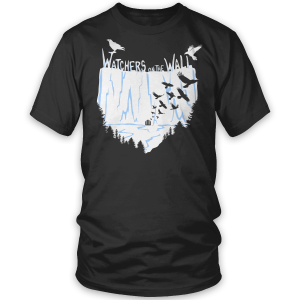
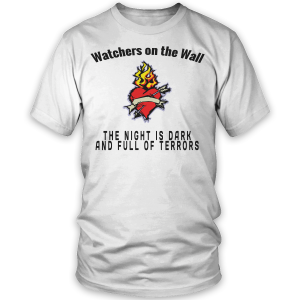
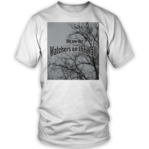
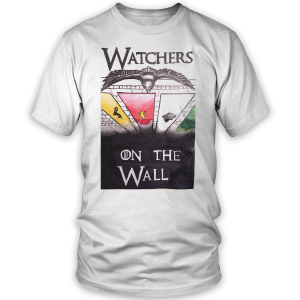
1. Watchers #1
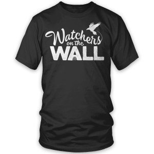
2. Watchers #2
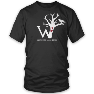
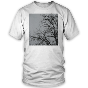
3. Weirwood
4. The Night is Dark
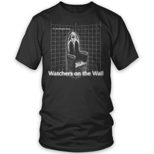
5. In the Beginning
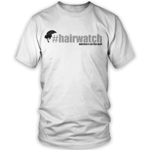
6. Hairwatch
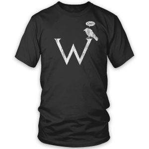
7. Corn
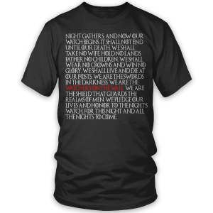
8. Oath
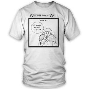
9. Interpretation
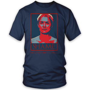
10. Shame
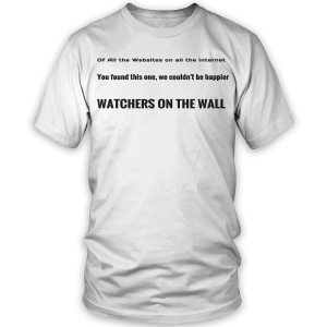
11. Of All the Websites
12. We Know Everything
13. Olly
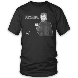
14. Fewer
15. Longclaw
16. Fewer #2
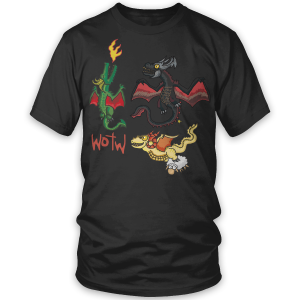
17. Cartoon Dragons
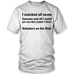
18. Seven Seasons (submitted before the news of 8 seasons)
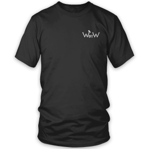
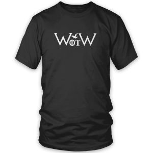
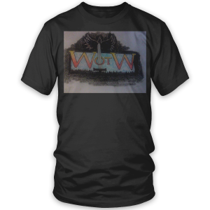
19. WotW #1
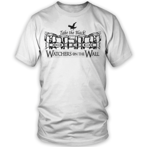
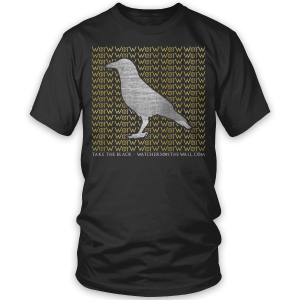
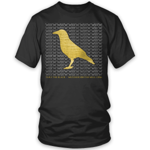
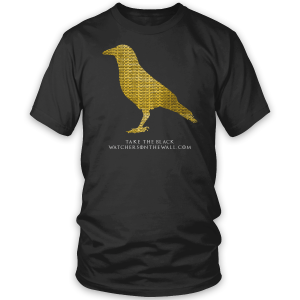
20. Take the Black #1
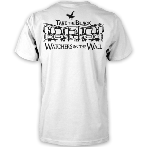
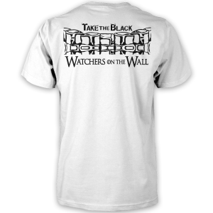
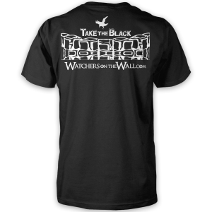
21. Take the Black #2 (Front/Back)
22. WotW #2 (Front/Back)
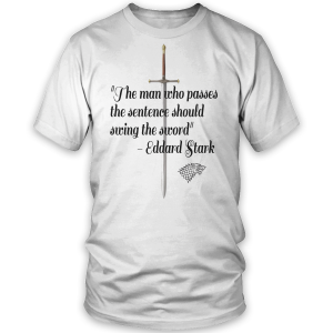
23. Swing the Sword (Front/Back)
24. WotW #3 (Front/Back)
25. WotW #4 (Front/Back)
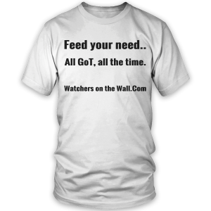
26. Feed Your Need
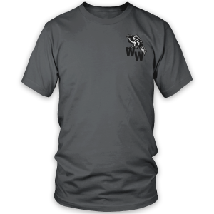
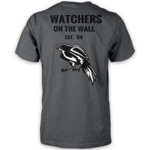
27. WW Est. 94 (Front/Back)
28. Watchers Raven
29. Watchers Raven #2
30. Always Support
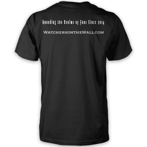
31. Guarding the Realms (Front/Back)
32. Watchers Raven #3
33. Watchers Raven #4
34. Hodor!
35. Watchers Raven #5
36. Crows
37. Others
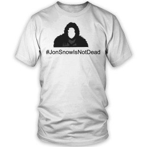
38. Not Dead
39. Crows #2
40. Banners
Voting is open for the next 48 hours. Campaign for your favorite in the comments!
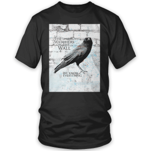
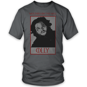
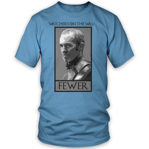
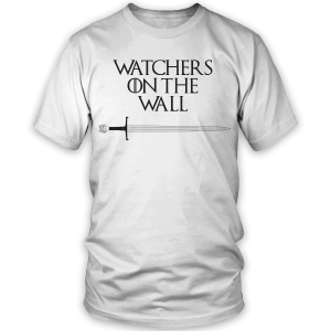


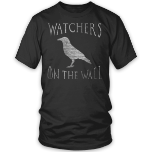
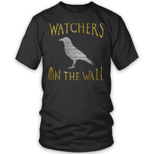
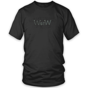
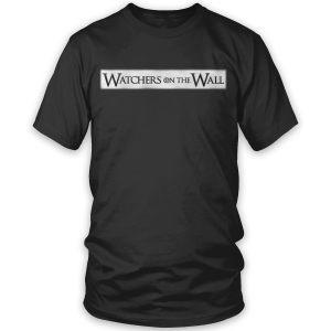

Lmao @ always support the bottom… that thing has gone a long way.
Voted 1, 2, 7, 27 and 28 based on what I’d actually wear.
Damn, too many good choices. Any chance the other 4 that make it into the top 5 will also be offered?
Great job to everyone who submitted! Can’t wait to see the results!
Awesome work! Congratulations to all participants for their effort!
Hodor!
What, no design with ‘support the bottom’? or did I miss one?
(edited) Oh I just saw it, but you can barely read the lettering. Pity.
These designs are great!! 😀 Hard to narrow down to 5
Great job on the designs everyone! Curious to see how this all plays out…
Ooo, great question. I’d buy all my Top 5 picks, tell you the truth. I’m such a fan of #33 but I’m loving the Raven looking down on the banners (#40). Pretty much sums up the whole concept of the Raven “watching” all of the happenings of the Houses/Realm.
I like the way “Banner” has the raven looking down. Symbolic ????????
Only 1 will be selected! That’s a shame, a lot of these are quite good.
1, 2, 3, 19, 28.
Hmm, why is there no design featuring the picture on top of the post the post? That one would abe awesome – white on black or grey preferably.
Strike one “the post”. Also, *be.
Hairwatch for the lol’s
No but seriously, why only one!! there are so many i would buy.
RandomGoTfan,
We are inquiring as to how many of the designs we can make available in the store. We would like to put as many options in as possible.
dee,
That submission was designed by the graphics department at SomethingInked. If there is enough interest, it will be made available as well.
Shame! Shame!
I really want this..
I agree…that was my favorite
Great designs one and all wish I,d got of my arse ????
Number 1 looks really cool
1, 6, 12, 16, and 28 based on what I’d be most inclined to wear. 6 would be my absolute top choice were it offered in a colour other than white.
I like #7 quite a lot!
some of these designs are really great, but I’m not in love with the SomethingInked system as it seems like the majority of these ended up really high on the shirts… is there a way to get them more vertically centered?
kind of nitpicky, i know, but it’s the sort of thing, for me, that would be the difference between saying “hey, cool shirts” and actually buying one.
Amazing work all around! It was difficult to narrow it down. Ultimately, I voted for 1, 8, 25, 32, and 35, but I would buy pretty much any of these designs if they were selected for production.
Watchers on the Wall,
I’m interested. The design featuring the distressed raven at the top of the post is extremely striking. I would definitely buy a shirt with that logo, in addition to whatever design is chosen from among the reader submissions.
Awesome work! Congrats to all! 🙂
My favs>> 8, 15, 21, 31, 38
8, 10, 14, 23 and 33 get my vote.
3, 7, 16, 24, 35
Me encanto el #33 y #40 … ESTAN GENIALES… BUEN TRABAJO!!!????????
Ginna PTY
That was difficult. They are all so clever. I chose 7, 12, 19, 30 and 34, although if I chose again it might be completely different. In narrowing the selection, I decided to avoid specific characters in the show, but I always smile at the “first comment to Hodor” precedent that has been set by the site participants, so that one had to get a vote.
Haha yes! 6 & 7 are mine! 😀 Boy, this is going to be tough to pick others… They’re all good!
dee,
Agreed. That would be a pretty cool shirt.
19, 22, 24, 25
I agree with this. I liked some of them, but then I felt like narrowing down this website (and its “logo”) to a specific house or character seemed to go against the general purpose of the website (all inclusive GoT news). Side note…while I may have a fascination with number 33…shout out to everyone who submitted a design and especially to those who actually hand drew a design. Hand-drawing things takes a lot of time and effort, so shout out to all those individuals.
#23 would be my first choice, but would prefer white on black rather than black on white. Also like #8, #14 (but on something other than that blue), #27 & #32.
I hope #32 & #33 don’t cancel each other out, the design is solid but it may miss out due to the vote being split between the two colour options.
Might have been better to vote on the design only to avoid splits, as there are several designs that fall into this trap, & then vote on colour schemes afterwards!
1,2,3,7,25
I really like the first design.
I’d choose between # 3 and 28
I agree with Feinix – it is really hard to make a decision here.
7. Corn
9. WotW #1
12. We Know Everything
16. Fewer #2
34. Hodor!
I really like some of these designs.
I wish mine had made it in, but since I couldn’t get it so the words in the design showed up large enough anyone could tell what they were, I’m guessing whoever said they’d put it in the design program and submit it couldn’t either. Ah well, I appreciate the thought they’d try to help.
I, too, love the one which goes with the article.
No free folk? 🙁 SHAME
Nymeria Warrior Queen,
Afternoon missus *waves*. Mine didn’t make the final cut either and ditto, couldn’t get it to work in the tshirt design site, so we can be rejects together! 😉
Some really good work here, well done guys. I am in love with the cartoon dragons, the sheep’s face is priceless. Would be great to offer more than one if possible as they are so different in style, or perhaps have some as badge, mug, keyring etc designs instead? Some might suit being on a smaller scale better and, of course, not everyone likes tshirts or has the budget for them, whereas other things would presumably be cheaper.
#7 and #16 for me.
I too did not see the “support the bottom” until I read through some comments. I would like to see that one withe the words a tad more legible.
Someone else also mentioned that the print alignment seems a tad high and off-set somehow. That is also a nit picky thing with me and if there is a way to center it up more then it should all be perfect. 🙂
Amazing job designers!
Watchers on the Wall,
There is interest here. I would buy one.
What about the “watchers on the wall” over the distressed-wings-outstretched-raven graphic from the top of this page? That’s the best image, imo.
Then again, I will never wear a shirt with a quote or a paragraph of text on it….
That said, I’ll find one to buy from the winners-(simple is best! -take the black 2, wotw1, or always support- please at least one of these 🙂
I have to admit that they are all really great. I’ve picked 5, but I could easily pick another 5. I also really like the one that goes with the article.
2, 4, 17, 24 and 40 were the ones I went with, but the choice is so much better than I thought it might be, because they’re all so good!!
Aryamad,
#7 is my favorite here!
And I just wanted to say that I saw 4 people commenting with one of my entries among their favorites and I’m so so happy =’)
/internethighfive thanks! 😀 which one is yours? I have to look through all of them (and the comments) later when I get home to my PC. Hard to view them all on the phone at work *continues pretending to work* >_>
Btw 6 I just made for laughs, I didn’t even expect it to make the cut!
All great designs. Well done everyone who entered!
Aryamad,
//internethighfives back
It’s the truth! I was hoping for a design about Mormont’s crow, I was so happy when I saw it! EDIT: whaaat you made also the #hairwatch one?? 2/2 then, wow!
You’ll see when you’ll have them on a bigger screen, there are so many good entries <3
( And mine are #9 and #16 :'D )
Much interest in SomethingInked design!
ALL of the designs are fun. Thanks to everyone who submitted. I now have my Christmas list sorted. 🙂
As a book reader, I like #7 and think it’s well done, but it’s purely a book reference. A particular Unsullied person had to ask me what that t-shirt was about, and that might be an issue, considering how many Unsullied readers how we have.
So many great designs, it’s hard to choose! We’re blessed with the difficult task of deciding amongst lots of good designs.
Awww Sue, #7 is my favorite, it’s a bit obscure, I love that.
Also picked #10, 17, 35 and had to do it, #34. LOL
It’s amazing how the choices are all over the place. LOL
That Shame one is the best! So funny. 7 is awesome too.
I wanted to do a back design that said “watchers on the wall” with the regular website font for 7 but I didn’t see a “front/back” option when designing it. Didn’t even occur to me to submit a SEPARATE back design. Too late now I guess. 🙁
Hodor! 😀
because… ya’ know… Hodor!
1 and 2 are “fuego” as the kids say these days..
#7 is by far my favourite… I really like #38 and #10 as well, although I wouldn’t feel right wearing that “Shame” T-shirt…
I voted 3, 7, 16, 29, and 40
As a book reader I love 7. Maybe too obscure for the unsullied but I want it though.
I would wear any of these shirts.
Voted 1 and 7.
7-12-14-18-27
Corn because the ravens are truly the stars of the books
Fewer because it always brings a slight smirk
All I got was this T-shirt because that’s what we all wind up with
1994 date because this is when it became public
Ravens know everything because that is the truth.
Well done 7 is my fave by far. I’m glad lots of people are voting for it so there’s a good chance I will be wearing it soon. If I saw 10 (shame) i would buy it very cool!
3, 7, 8, 15, 19
What a great bunch of options!
Can’t wait to see the finalists!
#7, #19, #34
#1 is the best shirt for this website. #16 is the best shirt in terms of actually wearing.
Wow! Love the hand drawn art! Fewer #2 definitely made me laugh! Ah, good ol’ Stannis…
## 3, 8, 12, 33, 35. My personal preference is for the more “classic” printing of “Watchers on the Wall.” While I appreciate the inside joke of #7, I want the first question asked of me by a non- or casual GoTer to be “What is ‘Watchers on the Wall'”?
I, too, prefer classic and understated (which kept me from voting for #35 btw–yellow? Would have preferred grey.). I voted: 8, 15, 18, 30. Wouldn’t wear any others, so I only voted for four choices; although I do like the design at the top of the post–maybe just on the left breast of a v-neck? Any chance for v-necks?
Those suggesting a correction to the “centering”: remember that t-shirts are meant to be tucked in, so centering it vertically would cause the design to disappear into the top of your pants. [cue off-color joke from Rygar…3…2…1…]
I would have loved a shirt with a picture of needle, and the quote ‘stick em with the pointy end’. Just sayin’
Some great stuff in there, I liked 28,29 and 6 “Hairwatch”
Went with 3 though
I like #8 because it provides context for the site name.
I really enjoy Watchers Raven #3-5. Although, I voted for Corn and Weirwood as well. Altogether its a really great bunch of designs! Minus Olly of course… I wouldn’t be caught dead wearing that shirt.
They are all great!
I voted for five which I’d wear, #3 is my favorite but I would also like the design on the top of this page! Why is it not there??
Damn, so many good choice’s.
I like the oath alot ????
1, 13, 40, 14
Fantastic submissions, everyone! I didn’t even pick my own (4)!
Done. Almost didn’t see the joke in 30, which makes it even more funny. 😀
HODOR! 😀 Could mean anything, right?
in my opinion those shirts should be black… so the white ones are not really my favourites. However: awesome work, folks!
Watchers on the Wall,
I liked that one, too! Count me interested.
These are all great. Wish there was one with #supportthebottom more prevalent. Guess I should have submitted!
*red face* I voted for two of my own submissions. But looking at all the others, I am so impressed with the creativity and artwork. It wasn’t hard to find three favorites.
Good luck to everyone who joined in the fun.
Jillybean,
I submitted one with “Always support the bottom” in small print along the bottom hem on the back, but it didn’t make the cut 🙁 thought it might make a fun badge tho’ 🙂
Great work. This community is pretty talented! I voted for some based on the quote, some based on design and some because it simply reminds me of WotW. Fewer, the cartoon dragons, Hodor, Swing the Sword quote, Take the Black wall One design. Pretty cool.
I voted #2, #3, #7, #19, and #28. Great work!