Death, in Game Of Thrones as much as in real life, is often loud, messy and graceless — but you’d never know it from Robert M. Ball’s “Beautiful Death” illustrations that commemorate the show’s most iconic or memorable deaths. Richly detailed and vividly colored, it’s hard to look at the posters and not be drawn in by both their beauty and the numerous references to previous seasons or lost characters.
“Symbolism plays a massive part in the posters,” Ball said in a recent interview with Insider. “As the series has gone on, I’ve crammed more and more references and details in as much as I can in there.”
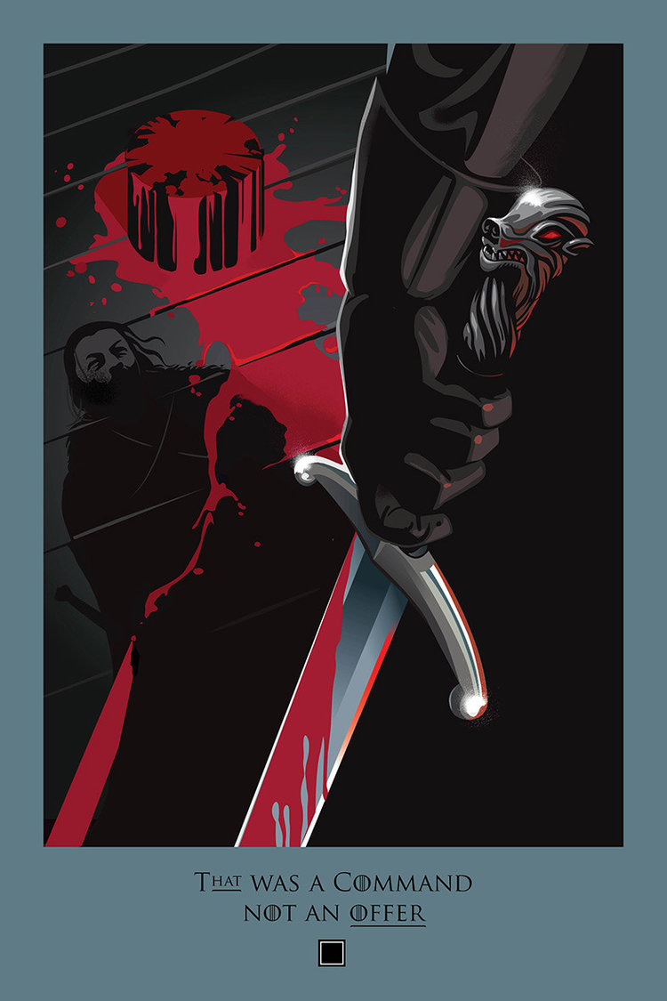
Ball often references various House sigils like the Stark direwolf, Lannister lion and Tyrell rose or dead characters. One of his favorites was the illustration for the beheading of Janos Slynt by Jon Snow, which “mirrored exactly the very first episode with Ned Stark beheading the deserter. What I could do with an illustration was make something explicit that was implicit in the episode.”
“In that illustration I’ve got the back of Jon Snow, but the shadow cast is of Ned Stark, his father, or who he thinks is his father,” Ball added. “He’s finally stepped into his shoes, and is ready to become King of the North. Any posters where I can add some meaning or tell a story, that’s very satisfying.”
Ball began the “Beautiful Death” series just before season 4 aired, creating a poster for each episode to remind viewers about what had happened in the previous three seasons. The fan response was immediate and enthusiastic, and he’s continued with the series ever since.
For the most recent episode, “The Spoils of War,” Ball recorded a time-lapse video of how he created the “Beautiful Death” illustration:
For Ball, who was a fan of Thrones before he began the illustrations, it’s an incredible opportunity to create art related to a show that he believes is the most entertaining show on television. He also believes it’s one of the most amusing, even if that perspective doesn’t find its way into a “Beautiful Death” illustration.
“I think it’s the biggest, most entertaining program on television,” Ball said. “I think it’s actually the funniest program, and I think that’s really what gives it the edge over all the programs of the same genre. It’s sometimes violent, gory, but its always tongue-in-cheek, and I like that. Tyrion in particular is hilarious.”
Ball also said he is careful not to put too many easily identifiable character faces in the posters — not only to make the artwork more mysterious and morbid, but so that he doesn’t spoil anything for those who haven’t yet seen the episode.
“The idea was that you should be able to see these images, and if you haven’t seen the episode they wouldn’t spoil what happens in the episode if you just see them for a split second,” said Ball, who noted that he does not receive any kind of “sneak peek” at the episode before it airs.
To read the full interview, go here. To see all of Ball’s “Beautiful Death” artwork, visit the website.
love Robert M. Ball’s work!!!
This is yet another beautiful depiction but, as I mentioned on another thread, I wish he had used this opportunity to work the Dothraki into one of his pieces. I think the horse warriors could produce some fantastic imagery.
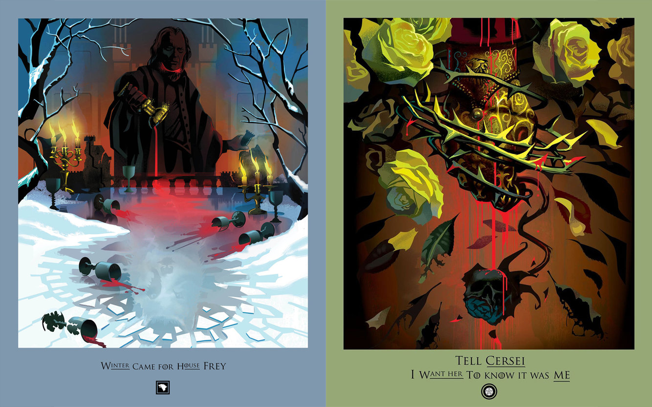
The one he did last week for the Queen of Thorns death might be my favorite of them all. It’s just perfect with the roses and thorns and the necklace with the poison that killed Joffrey. I now have it slightly ahead of the Hardhome one.
Ooo, the Frey poster is probably my favorite yet! And I love the Man of Fire poster, too. The digital process is fascinating.
I agree about how fantastic Dothraki horse warriors would be in one of his posters! Maybe in the future. He does have a way of fusing images together. Hardhome is one of my favorites too and Ned’s beheading always gets me with the birds flying away. I know HBO sells some of the posters and now puzzles, but I hope they do a book when the series is done, I’d buy that in a flash.
I love those “A Beautiful Death” posters. The minimalist artistic style that’s somehow packed with so much meaning and symbolism.
I will second the above suggestion that when this show is done, HBO releases a book (11×7 or bigger) with all the posters. I’d buy that in a heartbeat.
I love these posters. He captures the essence of the show and its key moments. I just purchased the Beautiful Death puzzle “Your Words Will Disappear.” Its probably my favorite of all his work.
I absolutely love the Beautiful Death posters. Robert Ball is an amazingly talented artist, and I’m so glad that this series has continued as the seasons has gone on. In the past, I’ve thought about buying individual prints from the HBO store, but they’re available infrequently, and generally not in the best format.
My hope is that once the show ends, HBO will release some kind of compendium book that I can purchase including all 73 posters for all 73 episodes. I’m sure it would be expensive as hell, but it would be well worth it! I see that several other commenters have already expressed the same wish!
Fortunately, my favorite Beautiful Death poster to date is the one I’m fortunate enough to actually own – the one from “The Watchers on the Wall”, commemorating Ygritte’s death in the Battle of Castle Black (“You know nothing, Jon Snow.”). I received that print when I bought a ticket to the IMAX screening of “The Watchers on the Wall” and “The Children” a few years ago, and I couldn’t have been happier. Alas, after moving, it’s no longer in perfect condition, but it’s a great keepsake nonetheless.
Agreed. Should have had the Dothraki
Not all his posters were successful but when it comes to season 7 I think he got much better and I like all of them and in particular the last 2. Tell Cersei and Enough with the clever plans…
I can easily see Robert Ball’s fantastic illustration work appearing in upscale (and well-paying) magazines like The New Yorker. Are you listening, Condé Nast?
I like his work, though his most recent poster could have been better as another user suggested above.
I’m amazed to see how this show has inspired people of with so many different talents!
I would go for that. They could release it like they did the history book – a coffee table book for Christmas.
OT, but there’s a lovely new interview with Kit. He talks about his GOT journey and though he can’t discuss it, says he has something interesting planned for after Thrones.
Catspaw Assassin,
They are!
From his site: Clients include HBO, Disney, ESPN, Sony, Wired and Conde Nast.
http://robertmball.com/about-contact/
I love his work too, but I think I preferred the simpler posters. The more recent ones… too much in them. Especially the Tell Cersei one I thought was boarding on kitsch.
My favorite ones: 6.9 (Your name will disappear – Ramsay is fed to the dogs), 5.10 (Do your duty – Stannis dies), 5.7 (Now his fire has gone out- Aemon Targaryen leaves this world), 4.7 (I lied for you, I killed for you – Lisa Arryn flies), 3.9 (The Lannisters send their regards), 1.7 (King Robert Baratheon murdered by a pig).
Aww, really? As I mentioned above that one may be my current favorite. I like that it not only is a tribute to Lady Olenna, but also to the end of House Tyrell. What do you not like about it?
Cool! I was in publishing for many years, on the design end, so here’s hoping they always pay their debts. (‾◡◝ )b